The Science Behind High-Converting Banners
After analyzing over 100,000 banner ads and their performance data, we've identified the key principles that separate top performers from the rest. These aren't arbitrary design opinions—they're data-backed strategies that consistently drive results.
Tip 1: Embrace the Rule of One
The highest-converting banners share a common trait: ruthless focus. One message. One visual focal point. One call-to-action.
Why it works: Banner ads have approximately 1-2 seconds to capture attention. Cluttered designs with multiple messages create cognitive overload, causing viewers to scroll past without engaging.
How to apply it:
- Limit your banner to a single key message
- Use one dominant visual element
- Include one clear CTA button
- Remove anything that doesn't directly support the conversion goal
Tip 2: Contrast is King
Low-contrast banners disappear into the page. High-contrast banners command attention.
The data: Our analysis shows banners with strong color contrast between the background and CTA button achieve 23% higher click-through rates on average.
Best practices:
- Use complementary colors for text on backgrounds
- Make CTA buttons visually distinct from other elements
- Test your banner in grayscale—if key elements disappear, you need more contrast
- Consider the context where your banner will appear
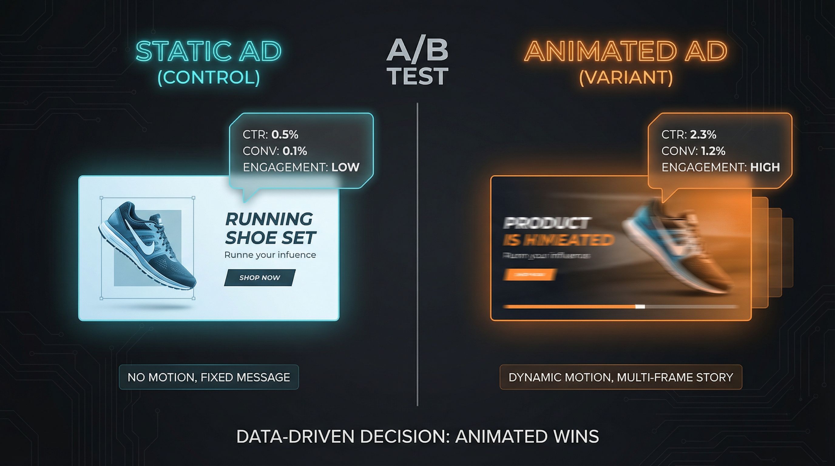
Tip 3: Motion Captures Attention (Use It Wisely)
Animated banners consistently outperform static ones, but there's a catch: the wrong kind of motion can hurt performance.
What works:
- Subtle movement that draws the eye to the CTA
- Smooth transitions between frames
- Motion that tells a micro-story
- Animation that highlights the key message
What doesn't work:
- Flashy, erratic animations
- Text that moves too fast to read
- Loops that distract from the message
- Excessive effects that slow loading
The sweet spot: 5-second animations with smooth easing perform best. They capture attention without overwhelming viewers.
Tip 4: Faces Drive Engagement
Human faces are attention magnets. Our brains are hardwired to notice and engage with faces before any other visual element.
The psychology: Faces trigger emotional responses and create connections. They can also direct attention—viewers naturally follow the gaze direction of faces in images.
Strategic application:
- Use faces that look toward your CTA or key message
- Ensure faces express emotions relevant to your offering
- Match the demographics of faces to your target audience
- Consider using AI face-swap to personalize at scale
Caution: Stock photo faces that look inauthentic can backfire. Authenticity matters.
Tip 5: Copy That Converts
Great design means nothing without compelling copy. The most effective banner text follows specific patterns:
Headlines that work:
- Start with the benefit, not the feature
- Use numbers when possible ("Save 50%", "3X faster")
- Create urgency without being pushy
- Speak to a specific pain point
CTA buttons that convert:
- Use action verbs ("Get", "Start", "Discover")
- Be specific about what happens next
- Consider first-person voice ("Get My Free Trial")
- Keep it short—2-4 words maximum
Examples:
- ❌ "Submit" → ✅ "Get My Quote"
- ❌ "Learn More" → ✅ "See How It Works"
- ❌ "Click Here" → ✅ "Start Free Trial"
Bonus: Test Everything
The best-performing banner is the one you haven't created yet. Continuous testing reveals insights that general best practices can't capture.
What to test:
- Different value propositions
- Various color schemes
- Multiple CTA button texts
- With/without faces
- Static vs. animated
How to test effectively:
- Change one element at a time
- Run tests long enough for statistical significance
- Document learnings for future campaigns
- Let data override opinions
Putting It All Together
Creating high-converting banners isn't about following trends or copying competitors. It's about understanding the psychological principles that drive engagement and applying them systematically.
Start with one tip. Master it. Then add another. Over time, these principles will become second nature, and your banner performance will reflect the improvement.
The difference between a 0.1% CTR and a 1% CTR isn't luck—it's strategy.
Mike Rodriguez
Creative Director
Mike has designed campaigns for Fortune 500 companies and brings 15 years of creative direction experience to AdMark Studio.